


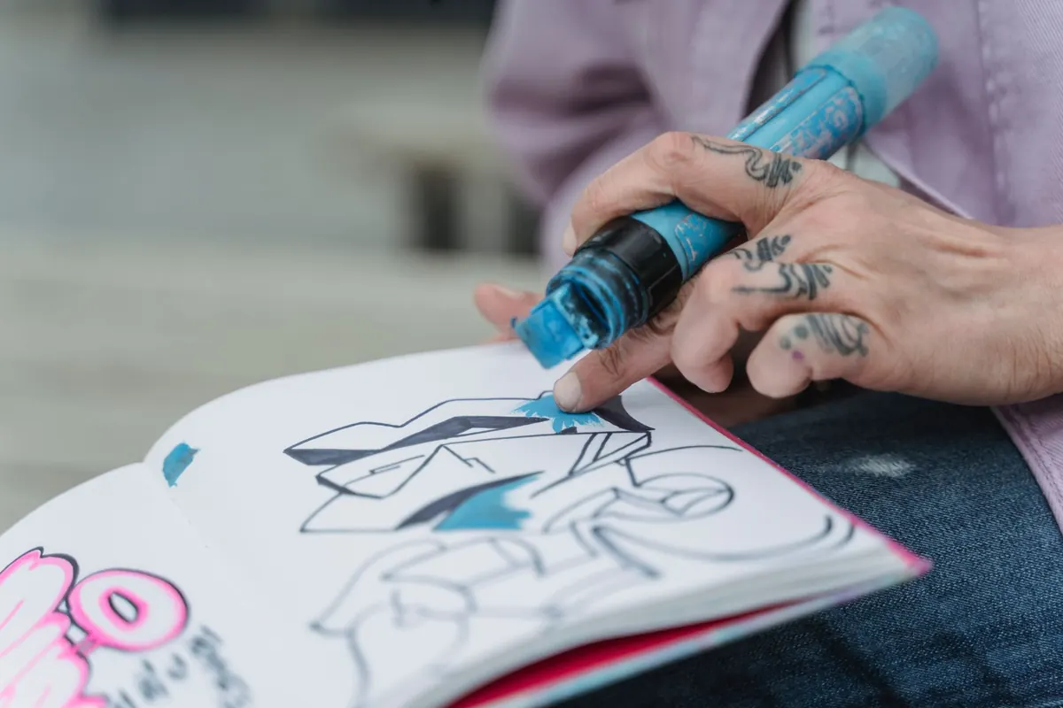
5 Common Mistakes in Design Portfolios (and How to Fix Them)
Most portfolios do not fail loudly. Nobody emails to say the work was dull or the case studies were hard to follow. They simply close the tab. That silence is the real problem, because it gives you nothing concrete to fix.
The encouraging part is that most portfolio weaknesses are structural rather than a reflection of your talent. They are about editing, ordering and explaining. Five of them come up again and again, and each has a repair you can make in an afternoon rather than a full rebuild.
1. Presenting an archive instead of an edit
Twenty projects, each with four images and a paragraph of description. The reader scrolls, finds no hierarchy, and comes away with the impression of "busy" rather than "good". Most people skim a portfolio the first time they open it. If your strongest work sits third from the bottom, there is a real chance it never gets seen.
The fix is subtraction. Aim for eight to twelve pieces and put your three strongest at the top, in that order, without apology. When two projects feel similar, keep the one where the problem was harder, even if the final image is less showy. Remove the rest from the site — not from your hard drive. If you are early in your career, a small self-initiated project with a clear idea beats a tidy but thin piece of client work, as long as you explain the thinking behind it.
2. Jumping straight to the final image
A beautiful mockup tells a reader what something looks like. It does not tell them how you think, which is what most people are actually assessing. Projects land far better when they carry a little context: what the problem was, what constraints you were working within, and which decisions you made along the way.
A simple four-part spine works for almost any case study:
- Context: who it was for and what needed solving.
- Your role: what you did, and who else was involved.
- The work: two or three images that show thinking, not just polish.
- The result: what changed afterwards, or what you learned if the project never shipped.
An early sketch or a discarded route can be more persuasive than another hero shot, provided you say why you moved away from it. Pair it with a sentence of plain explanation. "The first layout buried the price, so we moved it above the fold and tested it with six customers" does more work than three paragraphs of theory.
3. Making the reader guess what you did
Team projects are where this creeps in. "We redesigned the booking flow" is comfortable to write and useless to read, because nobody can tell whether you ran the research, sketched the alternatives or simply sat in the room. Say it plainly. "I ran the user interviews, then rebuilt the date picker" is not boasting; it is information.
The same applies to freelance and in-house work. Name the parts you owned, and be honest about the parts you did not. If you inherited someone else's design system, say so. Specificity builds more trust than a long list of disciplines, and it gives an interviewer something real to ask you about.
4. Ignoring how the portfolio actually feels to use
People will open your site on a phone, often on a slow connection, sometimes while standing in a queue. A portfolio that takes twelve seconds to load or that needs pinch-zooming to read has already lost before the work appears. Presentation problems read as carelessness, even when the design itself is strong.
Run through this before you share the link anywhere:
- Compress every image and check file sizes, not just how they look on your own screen.
- Test on a small phone and a slow connection, not only on your desktop.
- Keep crops and image widths consistent across projects so the page feels deliberate.
- Add short captions so images carry meaning when they appear alone.
- Write alt text for each image — it helps with accessibility and search.
- Check that a reader can reach your contact details in one tap.
5. Writing about yourself in adjectives
"A passionate designer who loves solving problems" could describe almost anyone with a laptop. Adjectives reassure you and tell the reader nothing. Concrete nouns and verbs do the opposite.
Replace the sweeping claims with facts: what kind of work you take on, the sectors you know, the tools you use daily, how you like to work with a team, and when you are available. Two or three honest sentences beat a page of positioning language. The same principle applies to your project titles — "Rebrand for a Leeds coffee roaster" is far more memorable than "Fresh identity, fresh start".
Then make the next step obvious. One email address, one line about what you are open to, and no puzzle-solving required.
A one-hour portfolio audit
Set a timer and work through this on your current site. Open the home page and ask a non-designer to look for sixty seconds, then tell you what you do and who you do it for. If they hesitate, your first screen needs rewriting.
Next, go through each project and check three things: can a stranger tell what the problem was, what your role was, and what happened as a result? If any answer is missing, write one sentence to fill the gap. Then delete your weakest project. It is usually obvious which one it is; the hesitation is the answer.
Finish by rewriting the opening line of your About page without a single adjective. When you are done, leave the whole thing alone for a month, then repeat the process. A portfolio is a working document, not a monument, and the version that gets you the next conversation is rarely the one that took the longest to build.
Photo: Kawê Rodrigues / Pexels